In the web development, understanding CSS units is crucial for creating responsive and visually appealing designs. Each CSS unit serves a specific purpose, catering to different aspects of layout and design responsiveness. We will introduce the differences between px, rem, em, vh, vw, %, and ch, and discuss how and when to use each unit effectively.
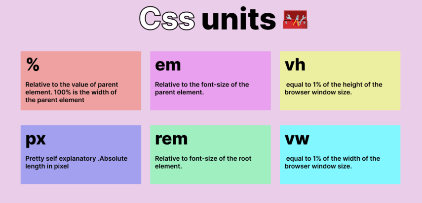
px (Pixels)
px stands for pixels and is the most commonly used unit in web design. It represents a single dot on a screen, and its size is fixed and does not change with the browser’s zoom settings.
Usage: Ideal for defining precise sizes, such as borders, margins, and fixed-width elements.
When to Use: Use px when we need elements to maintain a consistent size regardless of the screen size or zoom level.
1 | .element { |
rem (Root em)
rem stands for root em, which is relative to the font-size of the root element (html). Unlike em, which is relative to its parent element, rem is consistent across the entire document. 1 rem is equal to the font-size of the root element.
Usage: Useful for defining global sizes, especially for typography and spacing that should scale with the root font size.
When to Use: Use rem for overall layout and sizing that should be consistent across different sections of our website.
1 | html { |
em (Relative to Parent Font Size)
em is a relative unit that is based on the font-size of its parent element. If used within nested elements, em can compound and result in unexpected sizes.
Usage: Suitable for defining sizes that need to be relative to the font-size of the parent element.
When to Use: Use em for typography and spacing within elements where responsiveness to parent font size changes is desired.
1 | .parent { |
vh (Viewport Height) and vw (Viewport Width)
vh and vw are browser viewport-based units that represent a percentage of the viewport’s height and width, respectively. These units are useful for creating layouts that adjust dynamically based on the browser’s viewport size.
Usage: Perfect for creating elements that should fill a specific percentage of the browser viewport’s height or width.
When to Use: Use vh and vw for responsive designs where elements should scale based on the viewport dimensions.
1 | .element { |
% (Percentage)
% is a relative unit that is calculated based on the size of the parent element. It is widely used for creating fluid layouts and scaling elements proportionally.
Usage: Effective for creating responsive designs where elements should scale relative to their parent container.
When to Use: Use % for widths, heights, padding, and margins that need to adapt to the size of the parent element.
1 | .parent { |
ch (Character Width)
ch represents the width of the zero (0) character in the current font. It is useful for creating layouts based on the width of text characters.
Usage: Suitable for layouts that need to be based on the width of characters, such as creating fixed-width elements based on text content.
When to Use: Use ch when we need elements to be sized based on the number of characters they contain.
1 | .element { |
Conclusion
Understanding and using CSS units effectively is essential for creating modern, responsive web designs. Each unit — px, rem, em, vh, vw, %, and ch — serves a unique purpose in defining sizes and layouts. By leveraging these units appropriately, we can ensure that our web pages look great across various devices and screen sizes.
Happy coding!