In data analysis, we often need to create charts to visualize the data by using BI tools, such as Tableau, Power BI, AWS Quicksight, or Qlik Sense. These tools allow us to create interactive and visually appealing charts, which can help us to identify patterns and trends in the data.
General Solution Architecture for Data Analysis BI Chart
The general data analysis BI chart solution architecture like below:
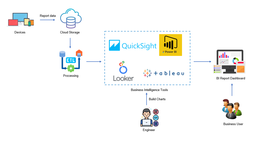
Usually, the engieering create business chart by using BI tools after data is ETL proceseed. If the business want to see the data distribution chart, they need to ask the data engineer to create the chart. The data engineer will create the chart using BI tools and share it with the business. This may take some time and effort.
Solution Architecture for Data Analysis BI Chart by Generative AI
Think about the scenario where the business want to see the data distribution chart without the data engineer’s help. How can we create the chart without the data engineer’s help?
One way to create the data distribution chart without the data engineer’s help is to use a generative AI model. The business just need to describe what the data they want to see and want to display as which chart type. The generative AI application will create the chart for them.
The core important thing we need to let the GenAI to understand user’s natural language and generate the information which application can be use. The solution architecture like below:
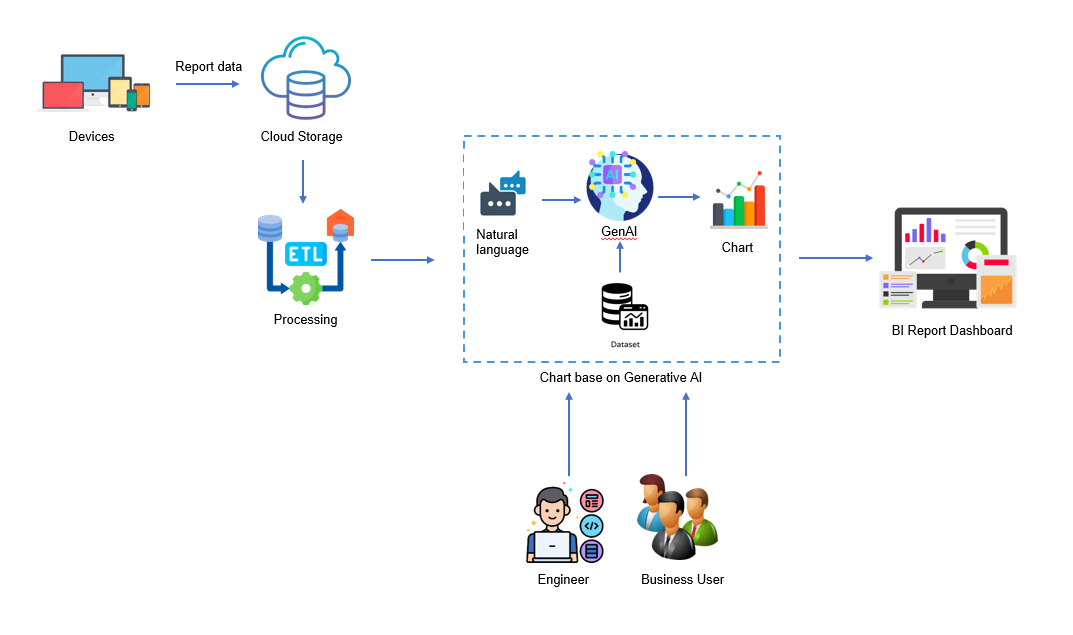
The AI application will take the user’s natural language as input and generate the chart for them. The AI application will use the following steps to generate the chart:
- Understand the user’s natural language and generate the chart title, chart type and chart related sql.
- Connect to the database or dataset and execute the chart related sql to get the data.
- Use the data to create the chart using the chart type.
The AI model could be ChatGPT, OpenAI or Claude model. The AI model will generate the chart related sql, chart type and chart title based on the user’s natural language. The AI model will use the chart type to create the chart.
For example, if the user’s natural language is “Show the distribution of the sales by product category”, the AI application will generate the chart title as “Sales Distribution by Product Category” and chart type as “Bar Chart”. The AI application will execute the following sql to get the data:
1 | SELECT product_category, SUM(sales) as total_sales |
Below is a demo to generate the chart for the user’s natural language base on testing sample data.
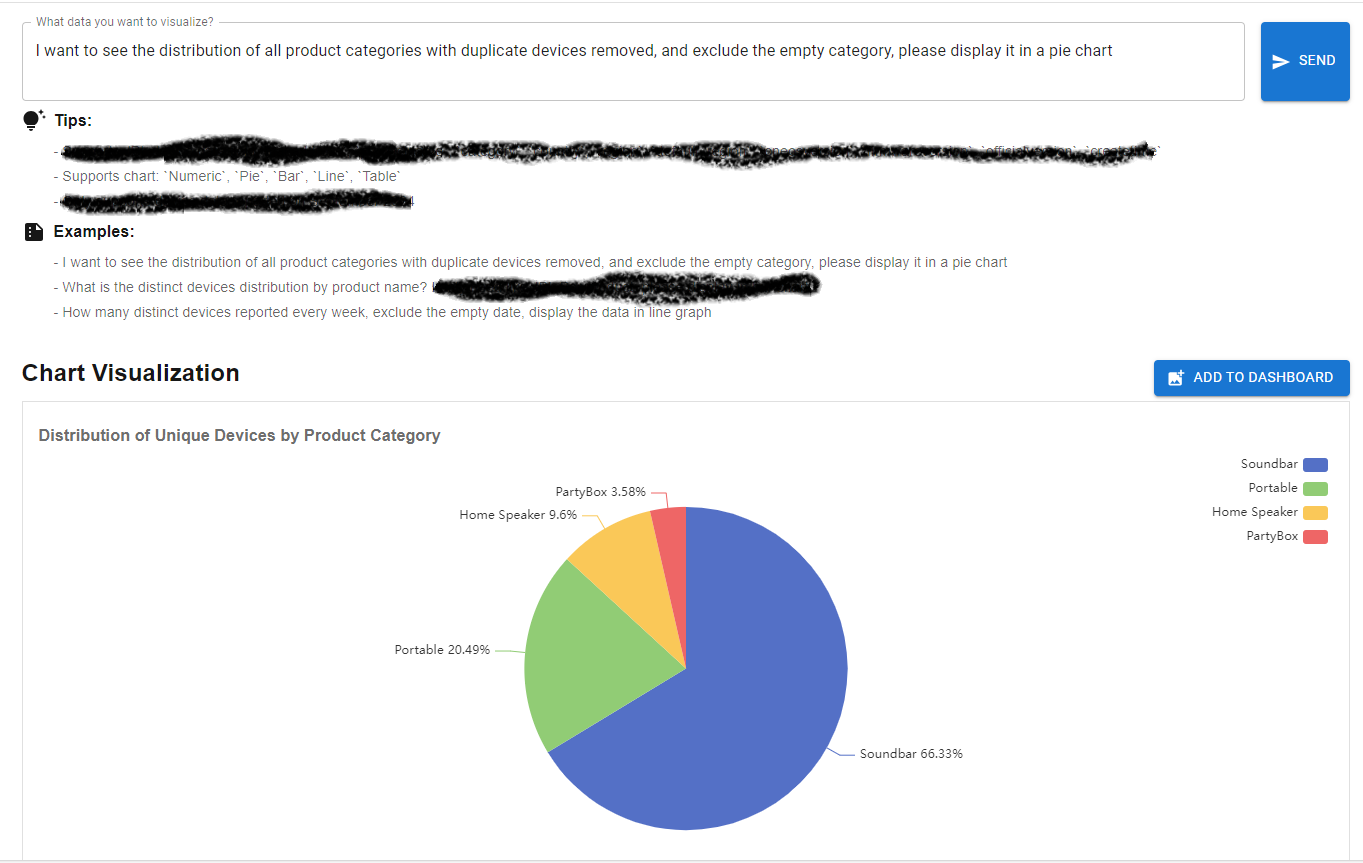
User input natural language:
1 | "I want to see the distribution of all product categories with duplicate devices removed, and exclude the empty category, please display it in a pie chart." |

The AI model response below base on the user’s natural language and prompts.
1 | { |
There is a question, how the AI model know to generate this data format for us? Actually it is because we provide the prompts to the AI model. The prompts will guide the AI model to generate the chart related sql, chart type and chart title. Below is sample prompts:
1 | You are a data analyst. Below is the table structure information about devices reported data. I will ask you questions, and then please generate the json data format {'sql':'','chart':'table','title':''} based on the questions I asked. |
We tell AI model the data schema and each field means, and indicate only need the json format response with specific field. Once the AI model generate the response, we can use it to create the chart for the user’s natural language.
We can also generate the line chart base on time line.
User input natural language:
1 | How many distinct devices reported every week, exclude the empty date, display the data in line graph |
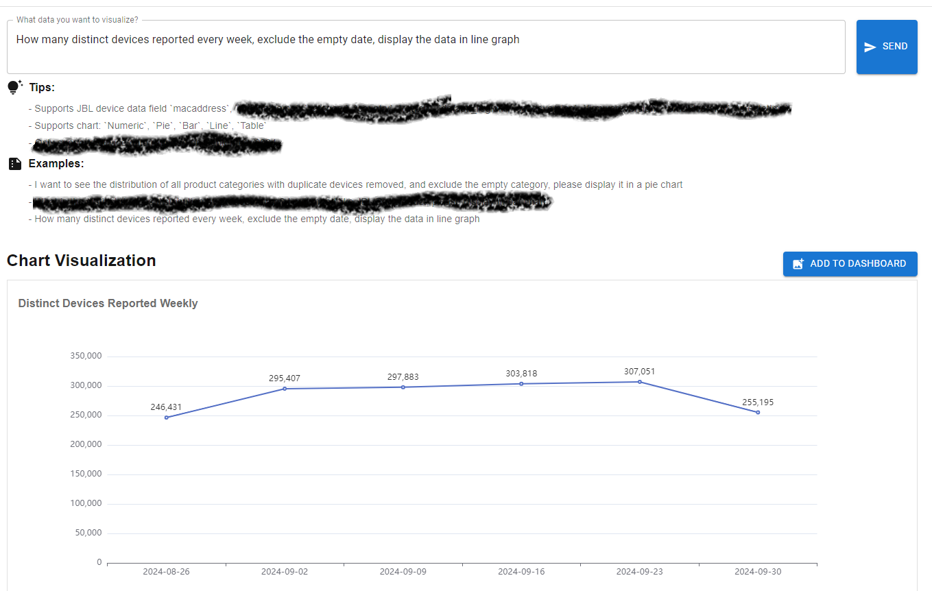
For the front-end UI to display the chart, we can use some chart library like Echarts, Hightcharts, D3.js or Chart.js. The front-end UI display the chart base on chart type and the data which queried by SQL.
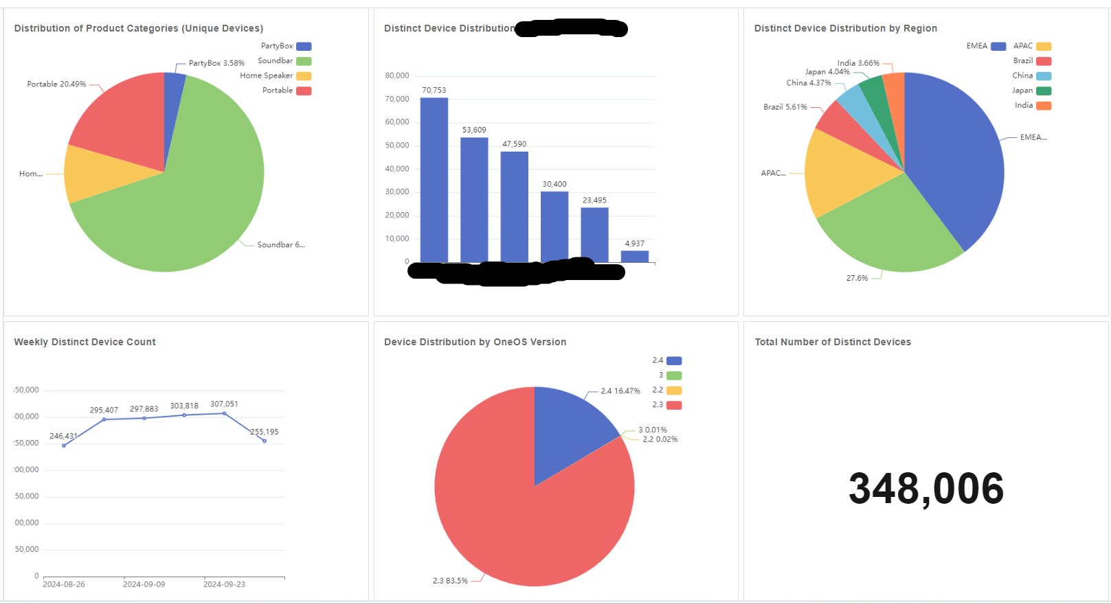
All these generated charts can be added into dashboard.
Limitation
As you can see, the AI solution architecture is a new way to create BI chart. However, it still has some limitations. It can not generate the complex chart which like some BI tools advanced chart fucntionality. But it is still a good start to create the chart for business users.


